Plutchik’s Wheel of Emotions is the first infographic that really got my attention. Isn’t it clever? Isn’t it illuminating? Yes and Yes. I was looking at it again recently, and Continue Reading
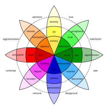
Plutchik’s Wheel of Emotions is the first infographic that really got my attention. Isn’t it clever? Isn’t it illuminating? Yes and Yes.
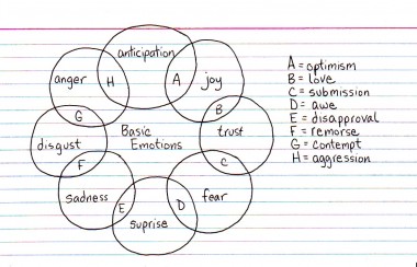
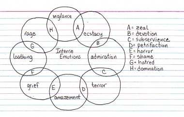
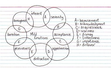
I was looking at it again recently, and I realized that while the original wheel works in Venn format (everything does, really), there are a lot of missing ‘feelings.’
I had to play with this! His wheel already lists feelings according to intensity (stronger in the center, weaker as the flower blooms), so I was able to use his words (as seen in each circle) as the bricks and add my own words (as seen in the overlaps) as the mortar.
And so here is my version of Plutchik’s wheel: one ring for each level of emotional intensity. Just looking at how they stack up, it’s really interesting how the more powerful the feeling is, the more rare it is to see it expressed in today’s professionally composed and politically correct world.


